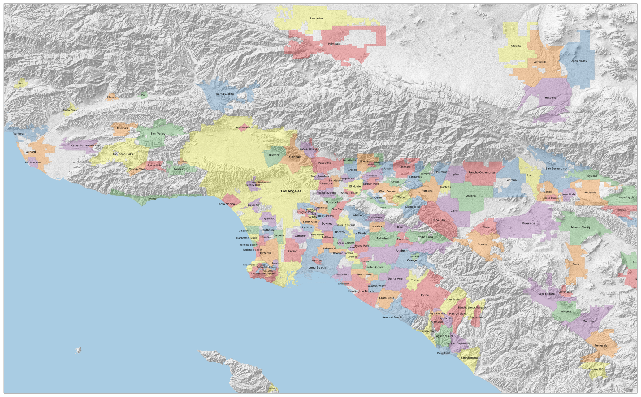
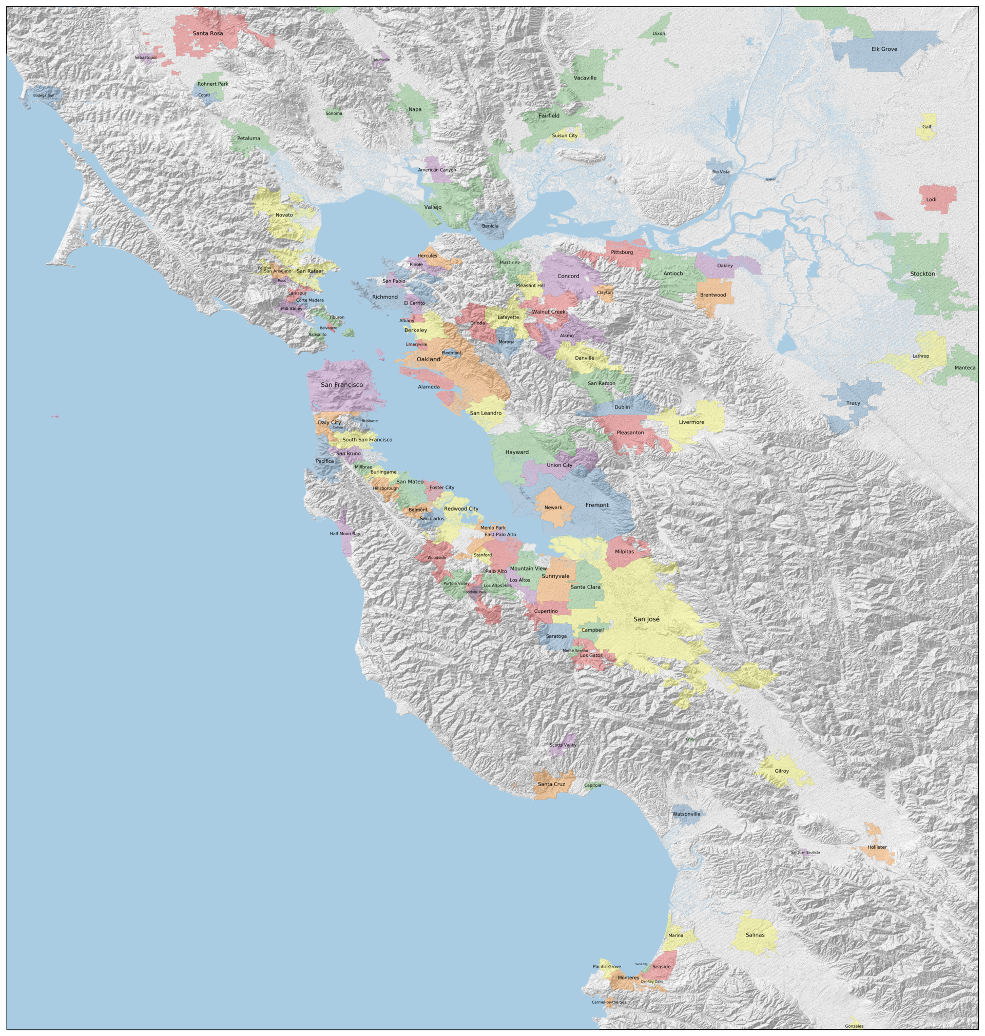
Mapping California Cities
Thu 08 February 2018
TL;DR: We are making these maps:
A couple of weeks ago a colleague told me that she was moving out of Oakland, California, to a city on the San Francisco peninsula called San Carlos. I had been a resident of the Bay Area for most of my life, and consider myself reasonably geographically aware, and I had never heard of San Carlos.
That sent me down a rabbit hole of trying to find a political map of the Bay Area that showed all of the incorporated municipalities. The Wikipedia article on the Bay Area claims that there are 101 cities and towns within the nine counties that make up the larger metropolitan area. Surprisingly, I was unable to come up with a map that actually showed those cities and their boundaries, or really anything close to that.
Meanwhile, I moved to Los Angeles. This is a new metropolitan area to me, and I am much less familiar with the patchwork of cities that comprise it. Again, I tried to find a map that showed these cities. I had a bit more success (this map gets pretty close), but still was missing some of the information that I wanted.
So, like any self-respecting geologist, I set out to make the maps I wanted. These maps would do the following:
- Show the incorporated municipalities in the metropolitan area. No counties, no parks, no neighborhoods, no unincorporated areas, no census-designated places.
- Show some of the physiography of the area. The placement and shape of human settlements are controlled by oceans, rivers, hills, and mountains. I find it annoying and confusing to look at maps that omit these, as the pattern of settlement winds up looking much more random than it actually is.
- Be somewhat nice to look at.
So, let's get started. I'll use the LA area as an example here, I used essentially the same code to generate the high-resolution map of the Bay Area.
Acquiring the data
To begin, we need to download the data, both political and physical.
Political data
The biggest source of open mapping data comes from the OpenStreetMap community. They have a truly staggering amount of data that is reasonably up-to-date.
The downside of this is that the data is so vast that it becomes difficult to download and parse. This website was useful to me in constructing the request for downloading a subset of the OSM data (in this case, a box around the LA metropolitan area).
The data is downloaded in an large binary database, which you then need to query for the data you want. There are a number of OSM readers available: I chose to use the Geospatial Data Abstraction Library (GDAL), which has the ability to read and transform vector and raster GIS data in just about any format.
The extract of all Southern California vector data is about 1 GB in size,
but we can extract the subset we are interested using a SQL-ish command
line argument for the GDAL program ogr2ogr:
ogr2ogr -sql "SELECT * FROM multipolygons WHERE admin_level='8'"\
        -f "ESRI Shapefile" data/la_cities data/los_angeles.osm.pbf
This command selects from the database all of the multipolygons
(your basic GIS data structure for shapes, including city borders)
where the admin_level property is set to '8', indicating a municipality.
The output format is set to ESRI Shapefile,
and the data is placed in the la_cities directory.
We will also have need for the populations of the cities, which is
located in the same database, but in a different table.
The following command extracts those populations, and stores them
in a GeoJSON file la_cities.geojson:
ogr2ogr -sql "SELECT * FROM points WHERE population IS NOT NULL and name IS NOT NULL"\
        -f "GeoJSON" data/la_cities.geojson data/los_angeles.osm.pbf
Physical data
We will use elevation data from NASA to construct the physiographic part of the map. The Shuttle Radar Topography Mission generated worldwide topography data at 10 meter resolution, which is good enough to make a very attractive map. Unfortunately, the data is a bit tricky to download, and the NASA website itself has a lot of dead links. This website provided a much better interface for downloading the same underlying data.
The data is, by default, downloadable in 1 degree by 1 degree chunks.
We can stich them together into one GeoTiff using the GDAL command-line tool gdal_merge.py:
gdal_merge.py -o data/socal.tif -of png data/N3?W1??.hgt
Once the physical and political data are downloaded and preprocessed, we are ready to start making the map!
Plotting the terrain
We can load the raw elevation data into our Python session using GDAL, and then plot it using the mapping library cartopy:
import gdal
import matplotlib.pyplot as plt
import cartopy.crs as ccrs

# Load the data
socal = gdal.Open('data/socal.tif')
z_data = socal.ReadAsArray()

# Plot the data
ax = plt.axes(projection=ccrs.PlateCarree())
ax.set_extent([-119.31,-116.9998611, 33.32, 34.74]) # Full LA metro area
srtm_extent=[-120.0001389, -116.9998611, 32.9998611, 35.0001389]
ax.imshow(z_data, cmap='gist_gray', alpha=0.5, origin='upper',
          transform=ccrs.PlateCarree(), extent=srtm_extent)

plt.savefig('images/socal_elev.png', bbox_inches='tight', dpi=300)
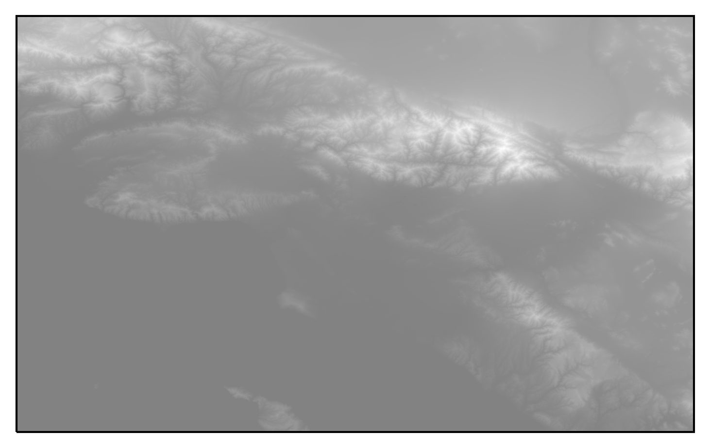
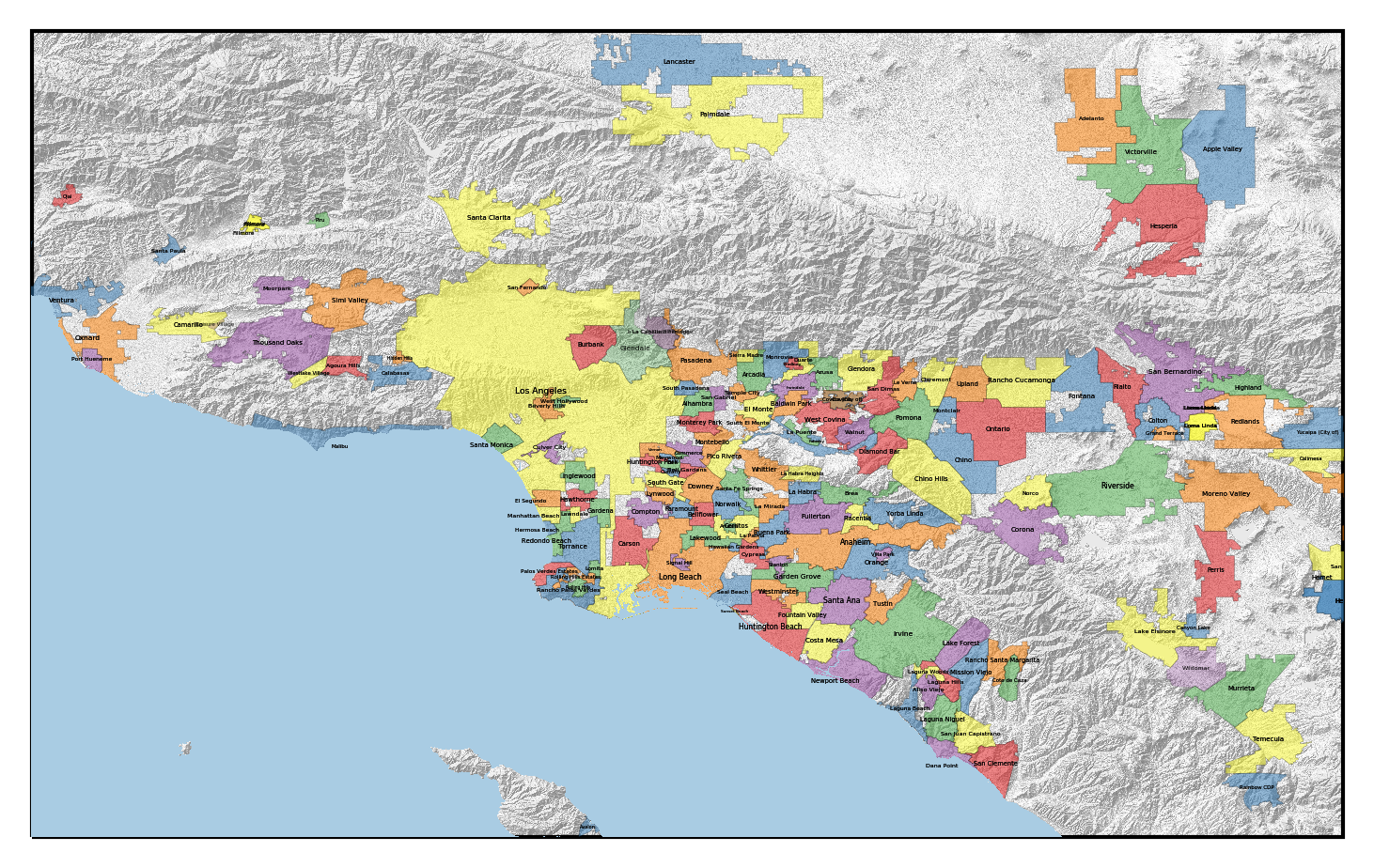
Okay, so this does indeed show the topography of the LA metro area. The San Gabriel Mountains are in the bright spot in the center, the Santa Monica Mountains/Hollywood Hills are to the southwest of them. The Palos Verdes peninsula is visible to the south of those, and Catalina Island can be seen at the bottom.
However, this image doesn't really pop. It turns out that visualization of topography works better with what is known as hillshading. This takes elevation data and shades it as if a light were shining on the slopes (usually with some vertical exaggeration). The resulting lumination map makes it much clearer to the human eye. Thankfully, matplotlib contains an illumination tool that does the job for us:
from matplotlib.colors import LightSource

# Generate the hillshaded intensity
ls = LightSource()
intensity = ls.hillshade(z_data, vert_exag=0.5)

# Plot the intensity
ax = plt.axes(projection=ccrs.PlateCarree())
ax.set_extent([-119.31,-116.9998611, 33.32, 34.74]) # Full LA metro area
ax.imshow(intensity, cmap='gist_gray', alpha=0.5, origin='upper',
          transform=ccrs.PlateCarree(), extent=srtm_extent)

plt.savefig('images/socal_hillshade.png', bbox_inches='tight', dpi=300)
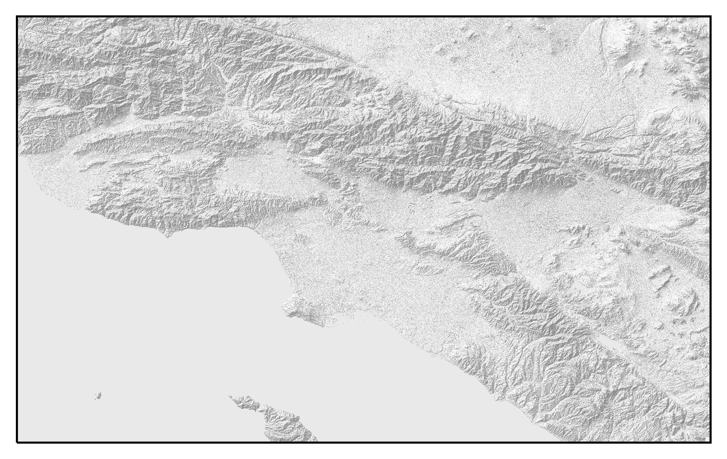
Much better! We can much more easily see the topographic features of the region, including the coastal plain, the San Fernando and San Gabriel Valleys, and the San Andreas fault.
Finally, it would be nice to have the water show up as blue. We can do this by making a masked array for where the elevation is zero, and color that blue:
import numpy.ma as ma
import numpy as np
from matplotlib.colors import LinearSegmentedColormap

# Construct a mask for water
water = ma.masked_where(z_data != 0, np.ones_like(z_data))

# Set up the axes
ax = plt.axes(projection=ccrs.PlateCarree())
ax.set_extent([-119.31,-116.9998611, 33.32, 34.74]) # Full LA metro area

# Plot the hillshade
ax.imshow(intensity, cmap='gist_gray', alpha=0.5, origin='upper',
          transform=ccrs.PlateCarree(), extent=srtm_extent)

#Make a pure blue colormap, and plot the water mask
cm = LinearSegmentedColormap.from_list('water',
     [(169/255, 204/255, 227/255),(169/255, 204/255, 227/255)])
ax.imshow(water, cmap=cm, origin='upper', alpha=1.0, extent=srtm_extent, zorder=10)

plt.savefig('images/socal_hillshade_water.png', bbox_inches='tight', dpi=300)
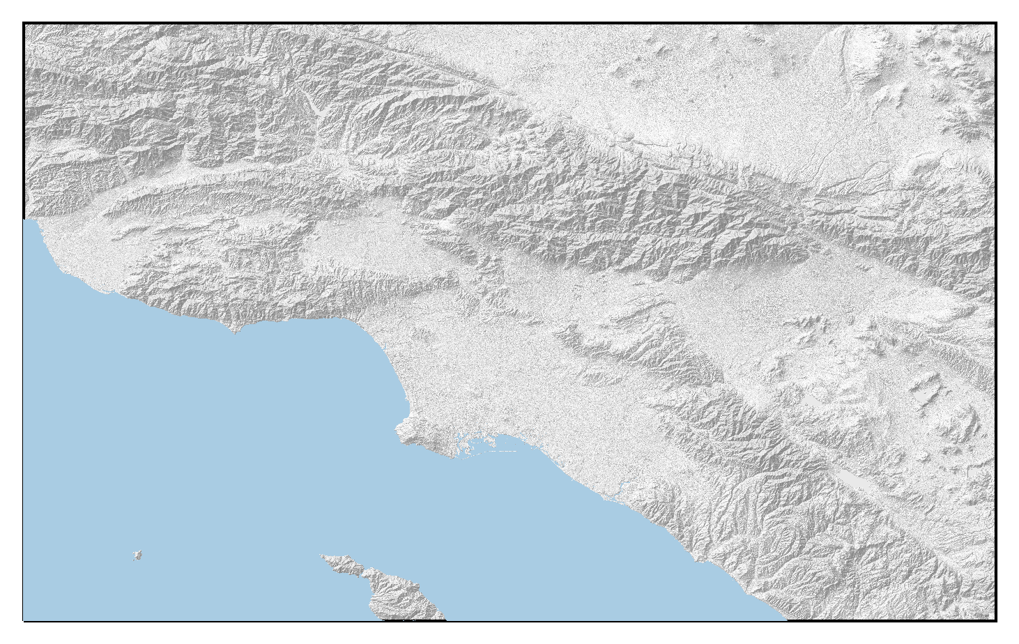 Okay, this is something we can work with.
Plotting the cities
Drawing shapes
Unlike the above, which was raster data, the city boundaries are vector data, and require a different pipeline for plotting them. We have already preprocessed the data into shapefiles above, for which cartopy has a reader.
We can loop over the entries in the shapefiles and plot them by running the following:
from cartopy.io import shapereader
reader = shapereader.Reader('data/la_cities/multipolygons.shp')

# Set up the map axes
ax = plt.axes(projection=ccrs.PlateCarree())

# Plot the shapes in the database
ax.set_extent([-119.31,-116.9998611, 33.32, 34.74]) # Full LA metro area
for record in reader.records():
    geometry = record.geometry
    ax.add_geometries([geometry], ccrs.PlateCarree(),
                      alpha=0.3, edgecolor='k', lw=0.5, zorder=5)

plt.savefig('images/socal_cities.png', bbox_inches='tight', dpi=300)
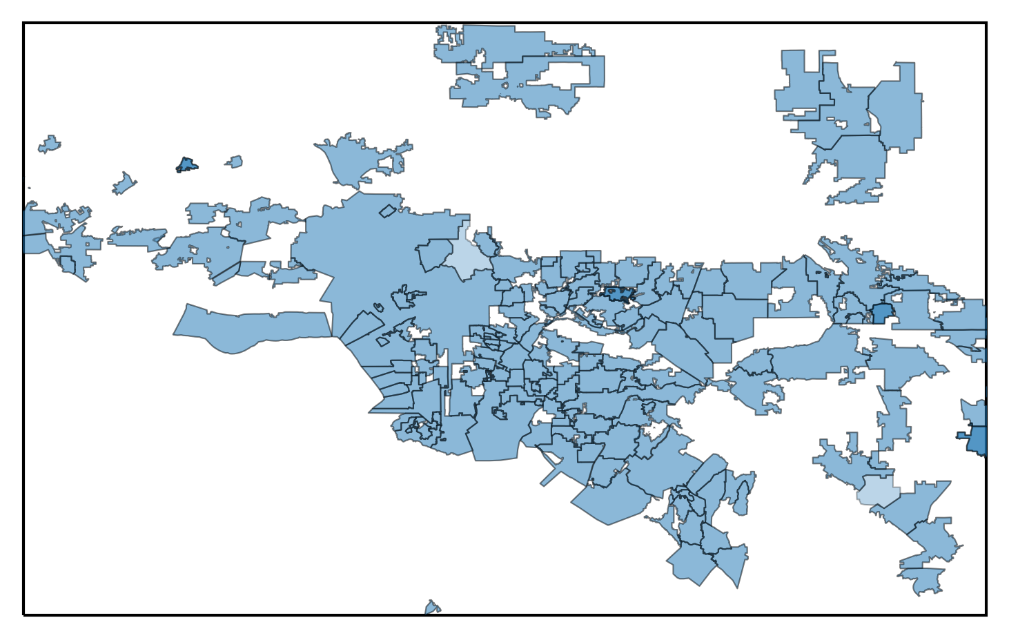
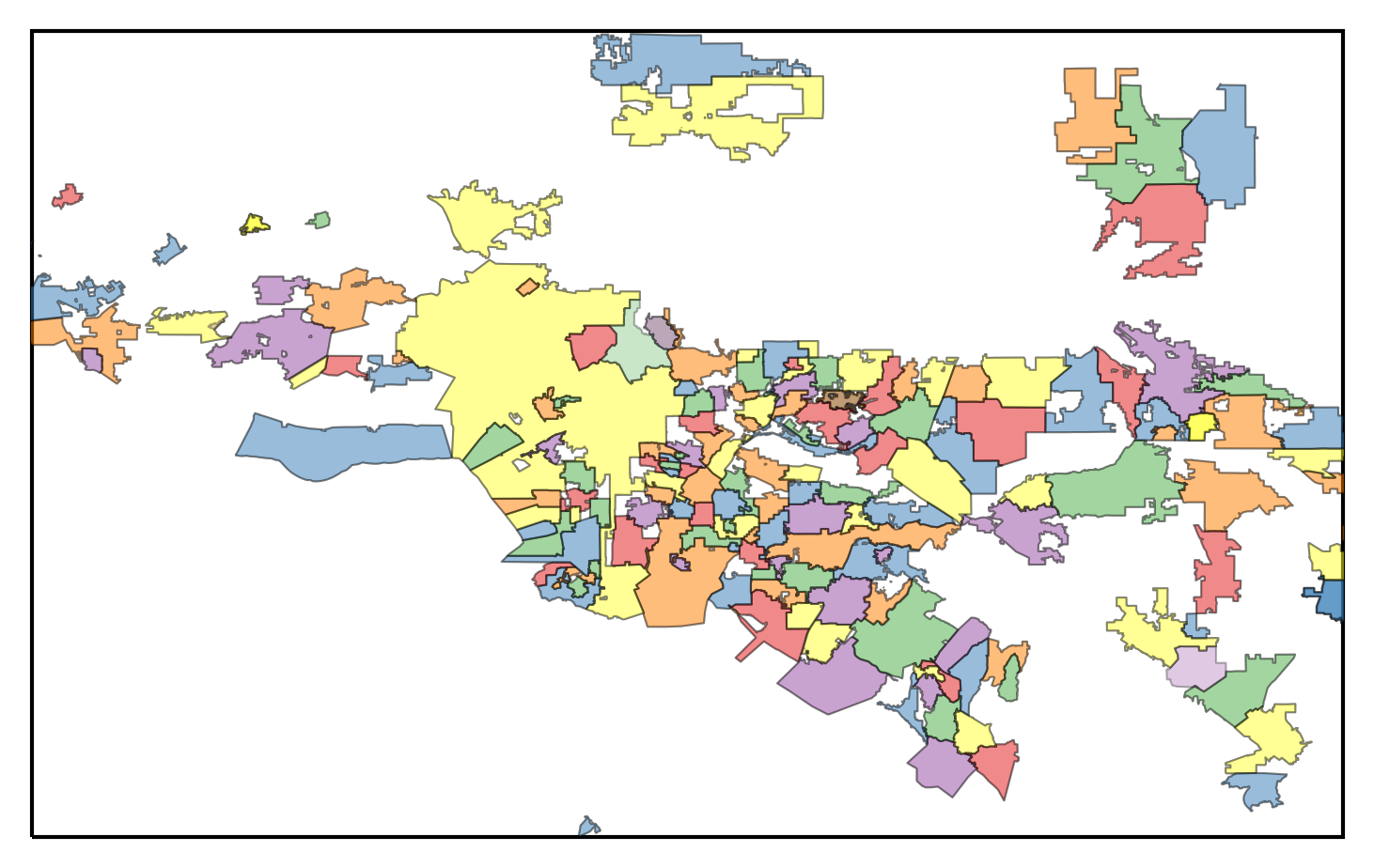
This map isn't terrible, but it is awfully monochromatic. We would like to have a map where the cities colored so that it is easier to distinguish them.
Assigning colors
Let's start by getting a qualitative colormap from the great ColorBrewer, and cycling throught them to assign colors to the map.
from itertools import cycle

# Create the color cycle
colors =['#e41a1c', '#377eb8', '#4daf4a', '#984ea3', '#ff7f00', '#ffff33']
colorcycle = cycle(colors)

# Set up the map axes
ax = plt.axes(projection=ccrs.PlateCarree())
ax.set_extent([-119.31,-116.9998611, 33.32, 34.74]) # Full LA metro area

# Plot the city shapes
for record in reader.records():
    geometry = record.geometry
    ax.add_geometries([geometry], ccrs.PlateCarree(), color=next(colorcycle),
                      alpha=0.3, edgecolor='k', lw=0.5, zorder=5)
plt.savefig('images/socal_cities_color.png', bbox_inches='tight', dpi=300)
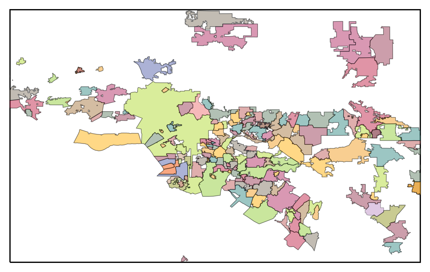
This is looking much better! However, if you look closely, you can see that there are many places where neighboring cities have been assigned the same color, which looks kind of funky, and makes the boundaries between them difficult to spot. We would like to set it up so that neighboring cities are not the same color.
As it happens, this problem is a classic one in graph theory, known as graph coloring. One of the most famous theorems in mathematics is the four color theorem, which (roughly) states that you can color a map so that no regions have a neighbor of the same color using only four colors. This theorem was among the first to be proved using a computer.
For our purposes, we can come up with a map coloring somewhat more easily by using more colors than four (six, in our case), and applying a greedy algorithm. The algorithm goes as follows:
- Compute the neighbors of each city by checking whether their boundaries intersect.
- Sort the cities in order of having the most neighbors to the least.
- Iterate through the list of cities in order. For each city pick a color that none of its neighbors are currently assigned.
As long as we have enough colors, we should be able to finds a coloring that
works using this algorithm.
We can check the intersection of two boundaries using the intersects()
function on the shapefile geometries.
The following function accomplishes that,
along with sorting the resulting dictionary:
from collections import OrderedDict

def generate_intersections(reader):
    # Make a dictionary to store the neighbors list of each city
    intersections = dict()
    # Iterate over the cities
    for city1 in reader.records():
        name1 = city1.attributes['name']
        # Break early if there is an invalid or duplicate name
        if name1 == '' or name1 in intersections:
            continue
        intersections[name1] = []
        # Check if each other city intersects the current one
        for city2 in reader.records():
            name2 = city2.attributes['name']
            # Break early if there is an invalid or duplicate name
            if name2 == '' or name1 == name2 or name2 in intersections[name1]:
                continue
            if city1.geometry.intersects(city2.geometry):
                print(f'{name1} intersects {name2}')
                intersections[name1].append(name2)
    # Once we have the intersections dictionary, sort them from most to least neighbors
    return OrderedDict((name, intersections[name]) for name in \
           sorted(intersections, key=lambda k: len(intersections[k]), reverse=True))
Once we have the ordered neighbors map from generate_intersections(),
we can apply the greedy color assignment (step 3):
import random

def greedy_coloring(neighbors_map, colors):
    # Make a dictionary for storing the city colors
    colormap = dict()
    # For this each city, try to find a color
    for city, neighbors in neighbors_map.items():
        # loop over the colors
        random.shuffle(colors)
        for color in colors:
            # Check if that color has not been used by one of the neighbors
            for neighbor in neighbors:
                if neighbor in colormap and colormap[neighbor] == color:
                    break
            else:
                # We found a color for the city that has not been used by a neighbor!
                colormap[city] = color
                break
        if city not in colormap:
            raise Exception(f'Could not find color for {city}')
    return colormap
So the whole calculation for color assignment looks like:
colors =['#e41a1c', '#377eb8', '#4daf4a', '#984ea3', '#ff7f00', '#ffff33']
colormap = greedy_coloring(generate_intersections(reader), colors)
And we can then create recreate the map using these color assignments:
# Set up the map axes
ax = plt.axes(projection=ccrs.PlateCarree())
ax.set_extent([-119.31,-116.9998611, 33.32, 34.74]) # Full LA metro area

# Plot the city shapes
for record in reader.records():
    name = record.attributes['name']
    geometry = record.geometry
    # Skip regions with invalid names
    if name == '':
        continue

    # Draw the shapes with their assigned color
    ax.add_geometries([geometry], ccrs.PlateCarree(), color=colormap[name],
                      alpha=0.3, edgecolor='k', lw=0.5, zorder=5)
plt.savefig('images/socal_cities_color_2.png', bbox_inches='tight', dpi=300)
 Much better!
Adding labels
This map is still not that useful if we want to know the names of any of the cities shown. We can naively try to plot them at the center of each city:
# Set up the map axes
ax = plt.axes(projection=ccrs.PlateCarree())
ax.set_extent([-119.31,-116.9998611, 33.32, 34.74]) # Full LA metro area

# Plot the city shapes
for record in reader.records():
    name = record.attributes['name']
    geometry = record.geometry
    # Skip regions with invalid names
    if name == '':
        continue

    # Draw the shapes with their assigned color
    ax.add_geometries([geometry], ccrs.PlateCarree(),
                      alpha=0.3, color=colormap[name],
                      edgecolor='k', lw=0.1, zorder=5)

    # Get the x and y position of the labels
    x = geometry.centroid.x
    y = geometry.centroid.y
    # Add the label text
    ax.text(x, y, name, fontsize=2, zorder=20, clip_on=True,
            ha='center', va='center', transform=ccrs.PlateCarree())

plt.savefig('images/socal_cities_color_labels.png', bbox_inches='tight', dpi=300)
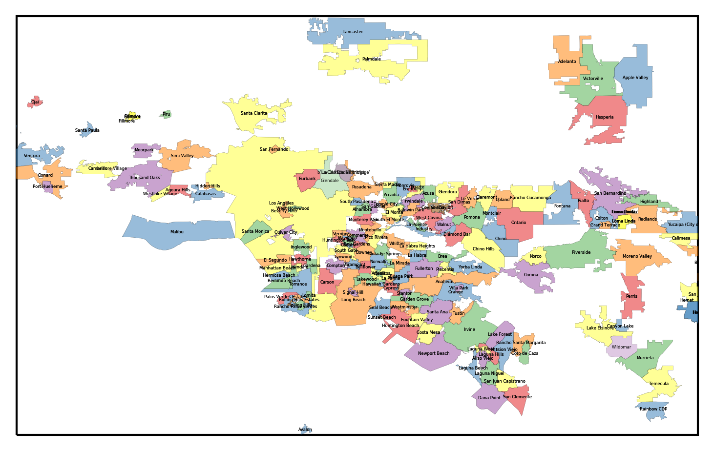
This is okay, but in some of the densest areas, the labels are overlapping each other. Furthermore, it would be nice for the labels for large, populous cities (like LA proper) to have larger labels than tiny towns. We could scale the label sizes with the population size, but then the label for Los Angeles (population several million) would be about four hundred times the size of the label for the City of Industry (population two-hundred). Instead, we will scale the label size with the log of the population.
First, we can create a dictionary holding the population of each city:
import json

f = open('data/la_cities.geojson')
city_data = json.load(f)
population = dict()
for record in city_data['features']:
    name = record['properties']['name']
    # Some populations contain commas, so strip those
    pop = int(record['properties']['population'].replace(',',''))
    if name in population:
        continue
    population[name] = pop
Now, we can recreate the labeled map using the appropriately-scaled labels:
# Set up the axes
ax = plt.axes(projection=ccrs.PlateCarree())
ax.set_extent([-119.31,-116.9998611, 33.32, 34.74]) # Full LA metro area

# Draw the city shapes
for record in reader.records():
    name = record.attributes['name']
    geometry = record.geometry

    # Skip regions with invalid names
    if name == '':
        continue
    ax.add_geometries([geometry], ccrs.PlateCarree(),
                      alpha=0.3, color=colormap[name],
                      edgecolor='k', lw=0.1, zorder=5)

    # Get the x and y position of the labels
    x = geometry.centroid.x
    y = geometry.centroid.y
    # If the population is in the population map (as it is for most cities),
    # assign the font size to the log of the population
    if population.get(name):
        size = np.log10(population[name])/3. if population[name] > 0 else 1
    else:
        size = np.log10(10000)/3.
    ax.text(x, y, name, fontsize=size, zorder=20, clip_on=True,
            ha='center', va='center', transform=ccrs.PlateCarree())

plt.savefig('images/socal_cities_color_labels_2.png', bbox_inches='tight', dpi=300)
Putting it all together
We are now ready to make the final map. We will plot the following, in order: 1. SRTM hillshade data 1. City polygons 1. Water mask 1. City labels
# Set up the map axes
ax = plt.axes(projection=ccrs.PlateCarree())
ax.set_extent([-119.31,-116.9998611, 33.32, 34.74]) # Full LA metro area

# Plot the hillshade
ax.imshow(intensity, cmap='gist_gray', alpha=0.5, origin='upper',
          transform=ccrs.PlateCarree(), extent=srtm_extent)

# Draw the city shapes
for record in reader.records():
    name = record.attributes['name']
    geometry = record.geometry

    # Skip regions with invalid names
    if name == '':
        continue

    # Draw the shapes with their assigned color
    ax.add_geometries([geometry], ccrs.PlateCarree(),
                      alpha=0.3, color=colormap[name],
                      edgecolor='k', lw=0.1, zorder=5)

    # Get the x and y position of the labels
    x = geometry.centroid.x
    y = geometry.centroid.y
    # If the population is in the population map (as it is for most cities),
    # assign the font size to the log of the population
    if population.get(name):
        size = np.log10(population[name])/3. if population[name] > 0 else 1
    else:
        size = np.log10(10000)/3.
    ax.text(x, y, name, fontsize=size, zorder=20, clip_on=True,
            ha='center', va='center', transform=ccrs.PlateCarree())

#Make a pure blue colormap, and plot the water mask
cm = LinearSegmentedColormap.from_list('water',
     [(169/255, 204/255, 227/255),(169/255, 204/255, 227/255)])
ax.imshow(water, cmap=cm, origin='upper', alpha=1.0, extent=srtm_extent, zorder=10)

plt.savefig('images/socal_total.png', bbox_inches='tight', dpi=300)
 And we are basically done!
Conclusions
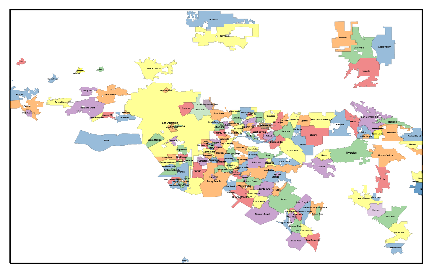
There are a bunch of more detailed tweaks that can make this map better than what I have shown here. There are duplicate entries to remove, labels to move around, and colors to shift. The maps shown at the top of this post have those tweaks incorporated.
I'll close with a few scattered thoughts about the process of making this map:
First, the data provided by OpenStreetMap is pretty great. It is free, downloadable, and has a huge amount of information. The downside is that the databases you download from OSM are poorly documented, and the data often needs to be substantially cleaned up. There are a lot of duplicate, contradictory, or nonsense entries. Some things are misclassified.
Second, the quantity and quality of data downloadable from USGS or NASA is awesome. However, as above, the web interfaces for locating and downloading it are confusing and poorly documented.
Finally, GDAL is indispensable for any kind of GIS processing. It understands just about any format you can throw at it, and is really fast. Unfortunately, it also has confusing and incomplete documentation (are you sensing a theme here?).
Feel free to let me know if you find this useful!